
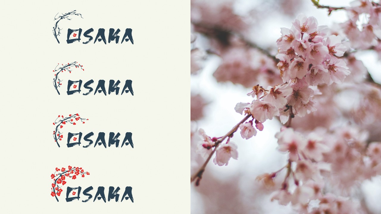
From Bangkok to Osaka, every FIDI Conference needs a distinctive identity that reflects FIDI, the conference themes and the host city. In this article, Alex Read, owner and designer, Bamb Creative, and, over the page, William Zamundu, FIDI Communications and Marketing Officer, give us a look behind the scenes at how each conference brand is conceived, developed and delivered – from the first creative discussions to the final design
When an organisation such as FIDI gears up for its annual conference, the event branding needs to do more than look good: it must feel authentic and genuinely reflect the spirit of the event. This is where I come in.
Over the past few years, I have designed the conference brand identity for cities including Bangkok, Edinburgh, Dubrovnik and, most recently, Osaka. So, how does a FIDI Conference brand come together and what’s involved?
To begin, FIDI and I will have a conversation to discuss potential concepts and creative directions. We all approach new projects with preconceptions and judgements, but the best creative work comes from pushing these aside and approaching every branding project with a blank screen.
This part of the project is pretty daunting. I feel a sense of urgency to find something I believe in so I can relax – but, of course, no good work comes from rushing, particularly not at the start.
With a sketchbook and the world wide web in front of me, I jump between useful websites, taking in a lot of information: history, traditions, trade, wildlife, nature, landscapes, produce, textures, patterns and more. I also check the hotel décor, because we want to avoid colour clashes. You have to explore a lot of ideas before something starts to feel perfect.
On the opposite page, you can see an unused concept for Bangkok. Even though it’s professional, colourful and custom-designed, there’s something not quite right about it. It feels too calm to be an event brand. Maybe it would suit a business advert or a massage brand – but it wasn’t right for the FIDI Conference.
Whereas the chosen concept shown in the adjacent image just fits and feels very FIDI. It has a lot of impact, from the fonts to the colours and the bold pattern.
Once a direction begins to emerge, the focus shifts to finding a central idea that feels natural, rather than forced. Research into the host city and country plays a big role here, but the aim is always to go beyond the obvious.
I know this isn’t always possible, but my ideal scenario is that a local member of the public, someone with no affiliation to FIDI, would approve of the design and how it represents their city.
I recently learned that the Osaka-based in-house audio-visual staff were visibly delighted when they were presented with the branding for the 2026 conference. If this feedback is on the same level as a client’s, it means I have done my job from both perspectives – and I know FIDI would also like to hear that the locals approve.
After the core brand is agreed with FIDI behind closed doors, I can expand it into a full toolkit for the conference, including social media designs, stage and screen design, signage, posters, email banners, sponsorship packs and merchandise.
The use of an extensive range of icons for Dubrovnik 2025 shows that, sometimes, the smallest asset can have a big impact if used in the right way.
Everything is designed to work together, whether it’s seen months in advance or experienced in the room.
Delivery is a collaborative effort, and we work closely with FIDI Marketing and Communications, as well as the event production company Missing Link, to ensure the brand translates seamlessly from screen to stage. We also work closely with HVP Studios, which animates the logo each year, a part of the project to which I always look forward.
Alex Read, owner and designer, Bamb Creative
As well as being a business owner, qualified marketeer and branding designer, I am a photographer. I was fortunate enough to be hired to join the conferences in Edinburgh and Dubrovnik as the photographer, which is a truly unique experience as the designer who branded the event.
By meeting FIDI members, staff and partners, it helps me understand what makes FIDI so special – the people, their ideas and a community formed around one business sector. Working on the ground, among all this, reinforces my commitment to deliver a design of which everyone can be proud.
So next time you take a selfie on the stage, just know a proud designer, sitting in his office on the south coast of the UK, probably overthinking letter spacing or colour shades, is extremely proud to be a part of it all.
Filling the blank canvas
William Zamundu, FIDI Communications and Marketing Officer
Alex talks about the blank screen and, for me, that appears the moment the previous conference wraps. While delegates are still buzzing about what they have just experienced, my mind is jumping ahead, asking: what does next year feel like; how do we top the amazing event we have just done?
Working with Alex has three parts to it: open conversation (the brainstorming stage), trust and letting go (this has become easier). He does the hard research work; I get to throw out ideas without dealing with the consequences. My job is to make sure his work aligns with what FIDI is and where we’re heading.
Branding a FIDI Conference is about creating an identity that becomes part of the overall experience – from the social media posts and emails, to water bottles, badges and large LED screens. My job is to set boundaries, clarify direction, and give the design team space to unleash full creativity.
One of the major challenges is how to make a design that doesn’t feel clichéd, cheap or redundant. I look for something that challenges expectations while feeling familiar. Think about how many times a Parisian has seen the Eiffel Tower, for example. How do you give them the Eiffel Tower in a way that makes even them want to look at it again?
With Osaka, the stakes felt higher. This city has been attempted for the conference twice before, and there is big anticipation building. We needed branding that would meet that anticipation visually. We chose new branding, because the old logo – while nice – would have visually pulled us back to those unsuccessful attempts. This brand gives us space to breathe.
Our favourite element has to be the cherry blossom branch that blooms. Not only does the concept align with the season when we will be in Osaka, but, more importantly, it is not static. The logo tells a story. Osaka in cherry blossom season means spring, new life. In this, we want to reflect FIDI’s position in relation to the shifts happening in our industry: AI; new technology; DSPs joining the membership; the new FAIM 3.4 standard. The visual embodies FIDI’s positive outlook amid uncertain times.
There are more elements to the branding that we’re excited for you to discover. That’s the fun part; seeing how it comes together when we collaborate with all the conference partners. The branding becomes an experience across video postcards, stage visuals, water bottles, badges, and every other touchpoint.
FIDI’s vision and mission is about setting the industry standard. That applies to everything we do, including branding. Nothing shy, bland or timid. We want to convey a big, bold and industry-leading position.
When you arrive in Osaka and see the branding come to life on stage, on your badge and in the other materials, know that it started with a blank canvas, a conversation and a commitment to representing FIDI well.